5 Tips for Museum Branding Strategy: Bringing Vikings to Life
Until recently, the Field’s digital presence did not fully reflect this ability to transport and transform. The microsites for its exhibits displayed a rigid grid design, featuring photo galleries of the artifacts and text descriptions that repeated the exhibit copy verbatim. By using this format, the Field Museum was fulfilling its mission of bringing the past to life–but perhaps unwittingly so!
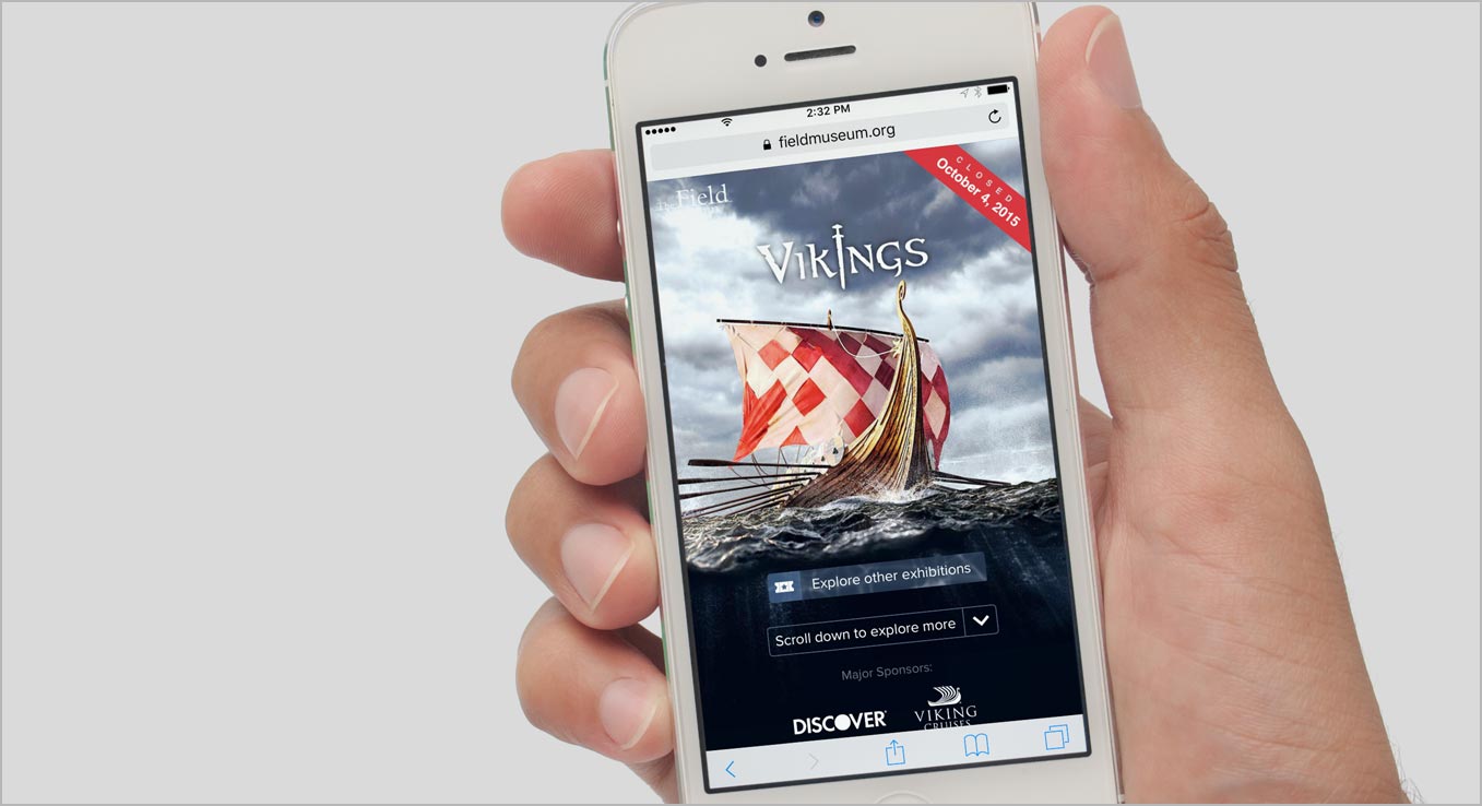
The Field has been revamping its digital strategy to transform such microsites into more technologically up-to-date and compelling narrative experiences, and Studio Pax has been fortunate to accompany the Field for part of this journey. One example is the Vikings exhibition website, showcasing the exhibit that ran from February to October 2015 and explored topics such as the Vikings’ lives as farmers, their religious traditions and the intricate crafts they produced and traded. After completing the project, we have some words of wisdom for anyone responsible for designing a museum exhibition website and shaping a museum’s digital branding strategy.
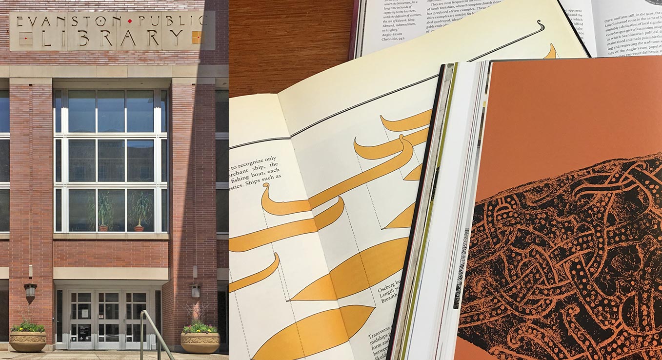
A good start for a cultural journey may be a trip to the bookstore or your local library to get infused in your historical source material. This is a healthy way to take stake of what’s been created as a vehicle for mass visual communication for a specific topic.
1. Find a way to make your budget go the extra mile
If you’re working with a limited budget and you’re considering an outside agency or freelancers for your marketing, be very specific about your needs and challenges when you’re discussing a potential collaboration. By taking the time to explain the context of your project and the limitations imposed by your budget, you can determine how your needs overlap with the creative services offered by your web partner. You may discover that they have potential approaches to the project that you wouldn’t have considered otherwise.
Since the Field is a both museum and a research institution, it must allocate its financial resources among several different areas: research, education, exhibits, etc. The marketing of their exhibitions is one number in that equation. So rather than focusing on developing a single microsite, Pax approached the project more holistically and proposed the digital team consider a framework for all sites’ user experience, user interface design and usability practices. Instead of a single deliverable, the Field Museum team now has a standard for a best-practices framework to use on its future microsites!
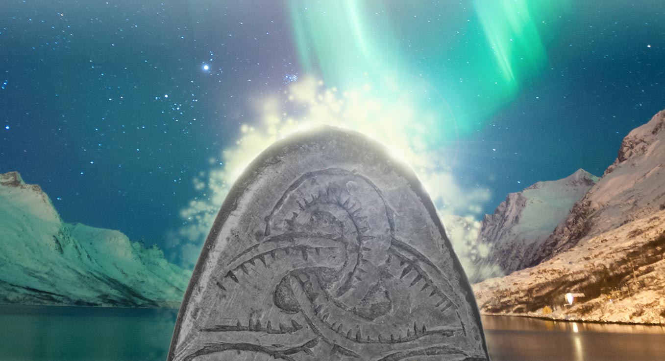
Above: We mixed evocative elements of the Vikings narrative (such as the monolith depicting mythological elements) with evocations of what the life could have been living under the Northern lights of a Scandinavian coastline (courtesy of a stock image from a Swedish locale).
2. Balance the institution’s needs with marketing objectives
Brad Dunn, the Field’s Web and Digital Communications Director, says that marketing the museum’s exhibits can be a high-wire act. Why? “We’re trying to ride a thin line where we…try to get people excited about science [and] reconnected with their own sense of curiosity. But there’s almost no degree of interpretation with the content that we deal with.”
We can say, “Come see the largest, most complete T-Rex ever found.’ Because that is factually true. But we can’t say, ‘Come see the most magnificent, amazing, geological specimen ever found.’ That’s not something that can be verified as a scientific fact.”
Pax had to walk a similar line between being faithful to the material while creating a digital experience that would appeal to the imagination of potential visitors. We knew that many people would be viewing the site on their phones or mobile devices, so walls of text describing the Vikings’ lifestyle weren’t going to get people through the doors.
Instead, we transformed the copy provided by the museum and made it much more mobile-friendly, translating that information into a combination of words, images and online interactions to materialize a holistic, multimedia experience mapping out the Vikings’ universe.
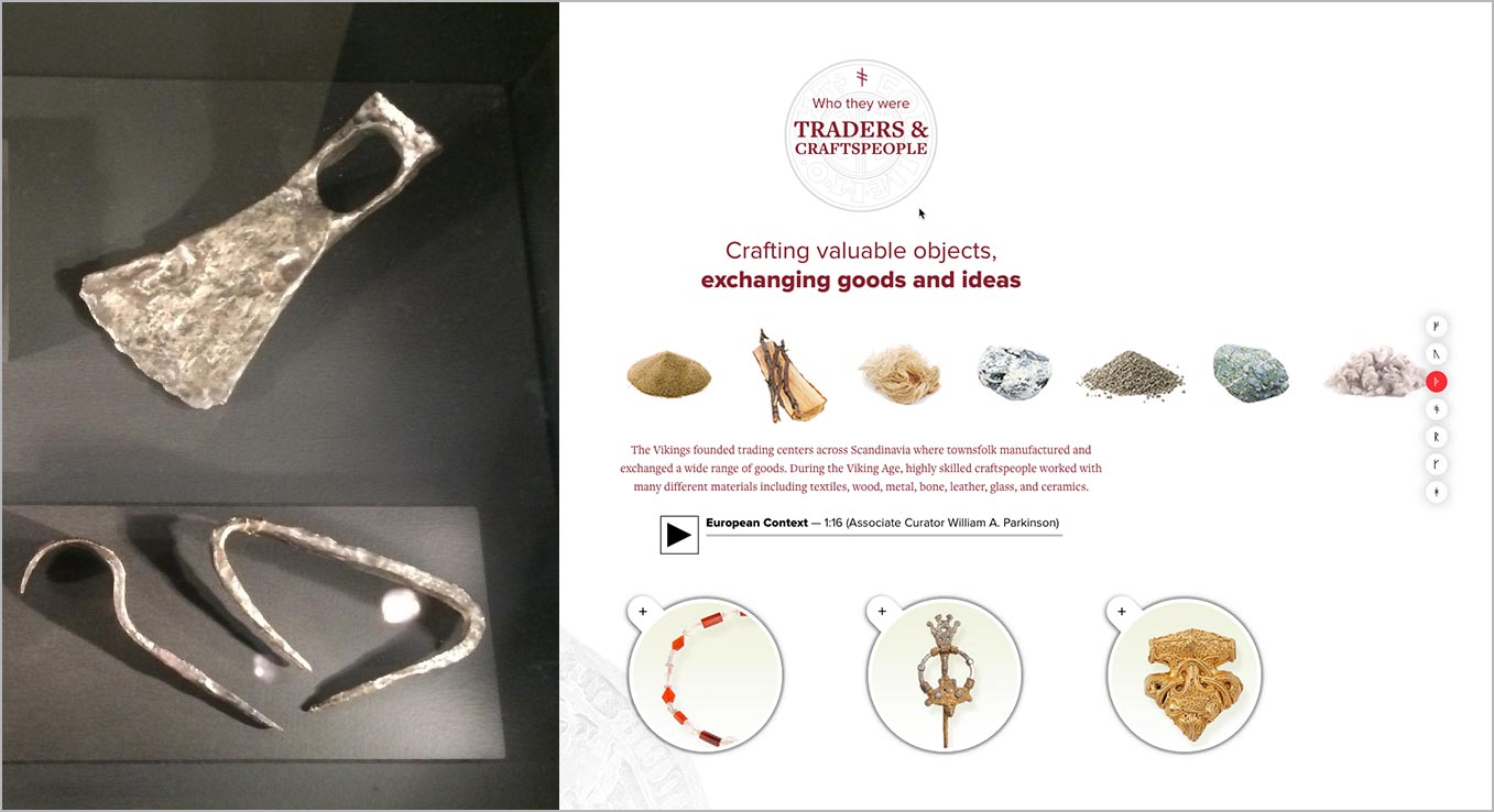
Above: An interpretation of the initial written content was to synthesize knowledge in a visual form. Whereas the original script of the website called for the use of various materials in trading, we wanted to make that reality more tangible and reflective of the exhibition itself. Dissociated from a background, the various images for the materials are presented in a museum display case simile. Audio recordings of the succulent curator William A. Parkinson were sprinkled in to give further life to the exhibit website.
3. Consider each element of your online content strategy carefully
In the past, Dunn says the text on the exhibit microsites consisted of “label copy, or the copy you see on the labels in an exhibition.”
When Pax started working on the Vikings project, however, the organization had shifted its content strategy to a more customized approach so that the online copy became an additional aspect of the design process.
“Pax played a big role in helping us think through that content strategy and how it could work together with design,” says Dunn. “So instead of being a bunch of content thrown into a visual structure and [placed] online, it was more like, ‘Look at the content, understand the design goals…fit [the content] more in line with those design goals, then design for it. [Pax] made us think about [content strategy] more holistically.”
4. Start with the content
While we helped the Field team think more carefully about design, the Field in turn had us thinking about how to focus on a content-first approach in the early stage of the process.
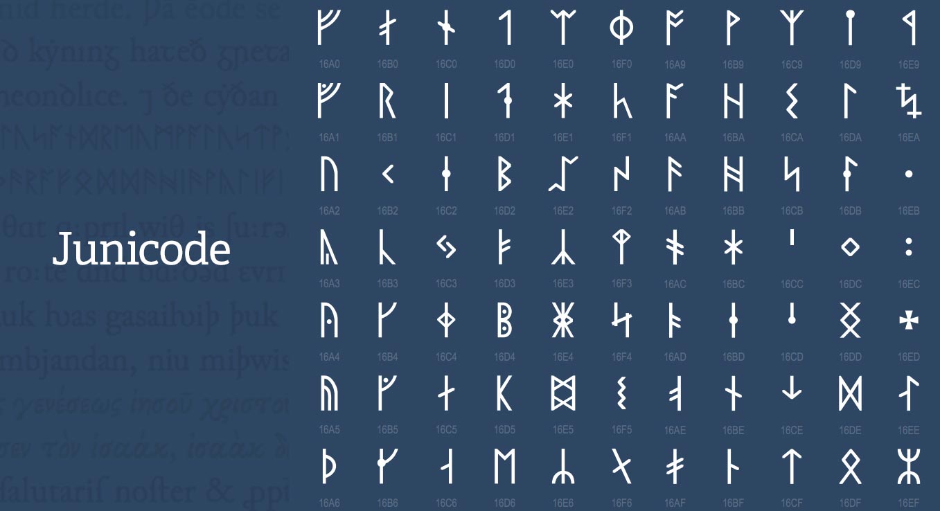
Above: Integrating Web technology and history—Junicode (short for Junius-Unicode) is a Unicode font for medievalists. It was developed by Peter S. Baker–you can download and use it under an Open Font License. Its original design is based on scans of George Hickes, Linguarum vett. septentrionalium thesaurus grammatico-criticus et archaeologicus and expanded to additional glyphs. We used the set of runic characters for Vikings.
The Vikings project was a different beast altogether. The Field had an abundance of content, such as multiple photos of the exhibit (which was not fully built at the time), blueprints and layouts of the various information panels and displays, yet the Field team wasn’t quite sure how to wrestle with all this physical content and transform it into a captivating online experience.
Because we wanted to transfer the in-person Vikings experience of the exhibit to the online realm, collaboration with the Field’s content writer was key. Through a back-and-forth process, we developed copy that was more appropriate for the digital world, shifting the exhibit’s formal and institutionalized tone to one that was more conversational and user-friendly.
5. Design for today’s multi-screen user
Besides the tone of the copy, we also looked closely at the ways users behaved when interacting with previous microsites. Prior analytics revealed that users visiting the Field’s site demonstrated a higher engagement and conversion for single page experiences as opposed to multiple pages.
As a result, the Vikings website used a single-page content model with topical sections; featured a “Buy Your Ticket” call to action button that followed users as they scrolled down the site; and established a global navigation element that would easily let users return to the Field site, no matter where they were on the page.
Ultimately, the Vikings site was the culmination of our own inquiries into the Vikings’ culture to understand how we could visually portray their lives; discussions of what the Field Museum stands for; and the balancing act of respecting the Field’s commitment to scientific accuracy while adhering to best practices for creating an engaging digital experience.
Above: if you missed Vikings, get a quick glimpse of what the physical exhibition was about
“Vikings was the most content-light [of the projects Pax and the Field did together],” says Dunn, “because we had to move so, so quickly. It really could have been so much more, but people were pretty excited about the visuals. And that’s 100 percent because of Pax.”
If you are facing similar challenges in creating a well-branded, content-heavy (or even content-light) website, feel free to reach out to us. We’d be happy to talk.
Angela Suico
Writer / Content Strategist
A storyteller by trade, Angela is passionate about storytelling and human-centered design. She recently received a Master's degree in Integrated Marketing Communications (IMC) at Northwestern University.
3 ways to improve and inspire Scientific Branding
How do you take a scientific organization focused on the infinitesimal and brand it in a big way?
Read More.
5 Comments
Submit a Comment
Have a project in mind?
Let’s chat about what we can do for you. We look forward to reading your emails, receiving your calls, and meeting you in person over a steaming cup of espresso.
This is an exceptionally well-written ‘how to.’ The holistic approach to copy, design and user experience was fascinating. I’d love to know more about how to do this with copy/content that doesn’t lend itself to the use of multiple images, i.e., healthcare or policy related websites.
Thank you for the comment, TLynne! That is an excellent question, and it could yield to a blog post of its own, to be honest.
While visuals are essential for any site—and we understand that healthcare and policy may be challenging areas to visualize— it may help you to realize that they’re a fragment of the more extensive branding equation.
In our experience, the main obstacles are due to the lack of proper photographic images or poor-quality images, substituted by generic stock images (a problem in itself in our visually hungry culture where you keep seeing the same faces promoting different brands. Ooops). To support in-house but poor-quality photos, you can use bold brand colors along with a simple yet recognizable design elements to supplement these pictures and art direct/brand such images (think the iconic National geographic frame surrounding each cover).
You may also take an approach favoring elegant and straightforward infographics translating a number-based fact. Consider half-page or full-page bold type treatments for quotes or story-driven facts.–that works well for Annual Reports. You don’t necessarily need a lot of adornments if you can commit to a single art direction repeated with a lot of care and certainty. Of course, that is if you still want visual elements to be part of your presentation. If it comes down to a purely text-driven deliverable, your organization may want to even consider the creation of a custom font in various weight so that it becomes a central element of your brand. Combined with a specific vocabulary of icons or symbols, it could be the key to a visually distinctive yet text-driven branding.
For an online channel, the core model is a robust research/content/design framework that involves content strategists, designers, developers, and other vital stakeholders all working together with a site as an outcome.
So for online work involving health care or policy, some of the questions the group can ask itself might include who are our stakeholders, what kind of information are they seeking from our site, and how quickly do they find it? What can we do to help them accomplish those tasks according to our core values (e.g., simplicity or thorough or frictionless)?
What struck me the most, after reading the steps taken in this huge endeavor and seeing the results, was the timeline of three months. Well done! This points to a tight, nimble team and process.
Thank you for the compliment, Jen! As a creative yourself, you are probably well-aware that working under certain limits can activate your creativity in ways you previously wouldn’t have thought possible. What are some of your tips for producing creative work under tight deadlines?
Thank you for your kind comments, Jen. We did have to adapt continually to changing project requirements, and we were the source of many of these changes as we kept discovering and exploring various approaches. Fortunately, the team on the client side was also quite nimble and responsive, which was vital. We kept switching the content model (i.e., mixing of copy, graphics, what carries the most weight, overall structure of the narrative, headlines roles, etc.) the most at the onset of the project so we would find our footing. We probably spent a good 40% of the project timeline exploring how the design+content process was affected, then how we would capitalize on that initial effort to plan for a framework as we kept working on following exhibition websites.