Mike Herbert is a Senior Design Associate, and Creative Design Process Manager for BCRA Design, a multi-disciplinary design firm based in Tacoma, Washington. We recently chatted with Mike about the evolution of experiential graphic design, his collaboration with professionals in other fields and his approach to helping clients clarify their brand identities.
Can you give me a little bit of background on yourself and your career?
I have, like many people who end up in experiential graphic design, come from a multi-disciplined background. I’ve been an architectural illustrator for a number of years. I’ve done illustration but my major focus has been in the three-dimensional realm working for a multi-disciplinary firm, specializing in different markets including medical, retail, hospitality, education and park design.
I’ve had the good fortune of working with a lot of different professionals as an experienced graphic designer. From psychologists to sociologists to people who are heavily into research and development and commercial work. Much of what we do is merging gaps between multiple professions to effectively communicate thoughts and complex messaging, so it’s a wonderful area to be involved with.
How has experiential graphic design evolved over the past ten years, and where do you see it going in the future?
Over the last ten years, I think some of the largest changes have been that other professions have started to recognize that we exist, number one. Two, that we can be a valuable part of the human experience on any given design project, particularly in dealing with engaging environments. And, so you’re seeing many of those specialized professionals being embedded in architecture firms, as well as firms like IDEO.
But you’re also seeing more and more smaller shops, and they’ve become more in demand because this area of specialization that, just because you’re trained as a graphic designer or an architect, that doesn’t mean you fully grasp what we do. It’s a merging of a lot of different knowledge bases and experiences. I think that’s why a lot of people end up here. They don’t want the boundaries that some professions like to tag on to you.
In the last ten years, I’ve seen a lot more people want to challenge themselves for living in that gray land. They want to play in this world a bit more. Curriculum-wise, some schools are significantly adding to their programs, where ten years ago, virtually no schools had significant coursework in it. More schools are starting to understand this is a realm that requires education and support.
You said that you’ve had the opportunity to work with psychologists and sociologists and people from other fields. How were those collaborations involved in the work that you do?
It can be somewhat dependent on the market segment or the project that’s at hand, but a lot of times we have opportunities to work with other professions. When designing exhibits for children, for instance, and we need psychologists to understand the way children’s minds process at different ages. We have the scientists there, not only to use them as a resource for direct information, but oftentimes we’ll also do fact checks and review/test designed interactive modules, whether it’s virtual or real-time. And we will actually dive into how a subgroup is really reacting to test samples and take that information and apply it to our work.
I just finished a series of projects, for a medical group that is rolling out urgent care facilities. We are sitting down with them to understand what their medical procedures are. We’re also talking to them about how other people work in public spaces from a hospitality and hotel sensibility. We’re sitting down and saying, “How can you marry the procedural medical methodology with how visitors interact with practitioners and environments associated with other markets and professions?”
We consider our client to be an extremely active component in the process of providing any successful project.
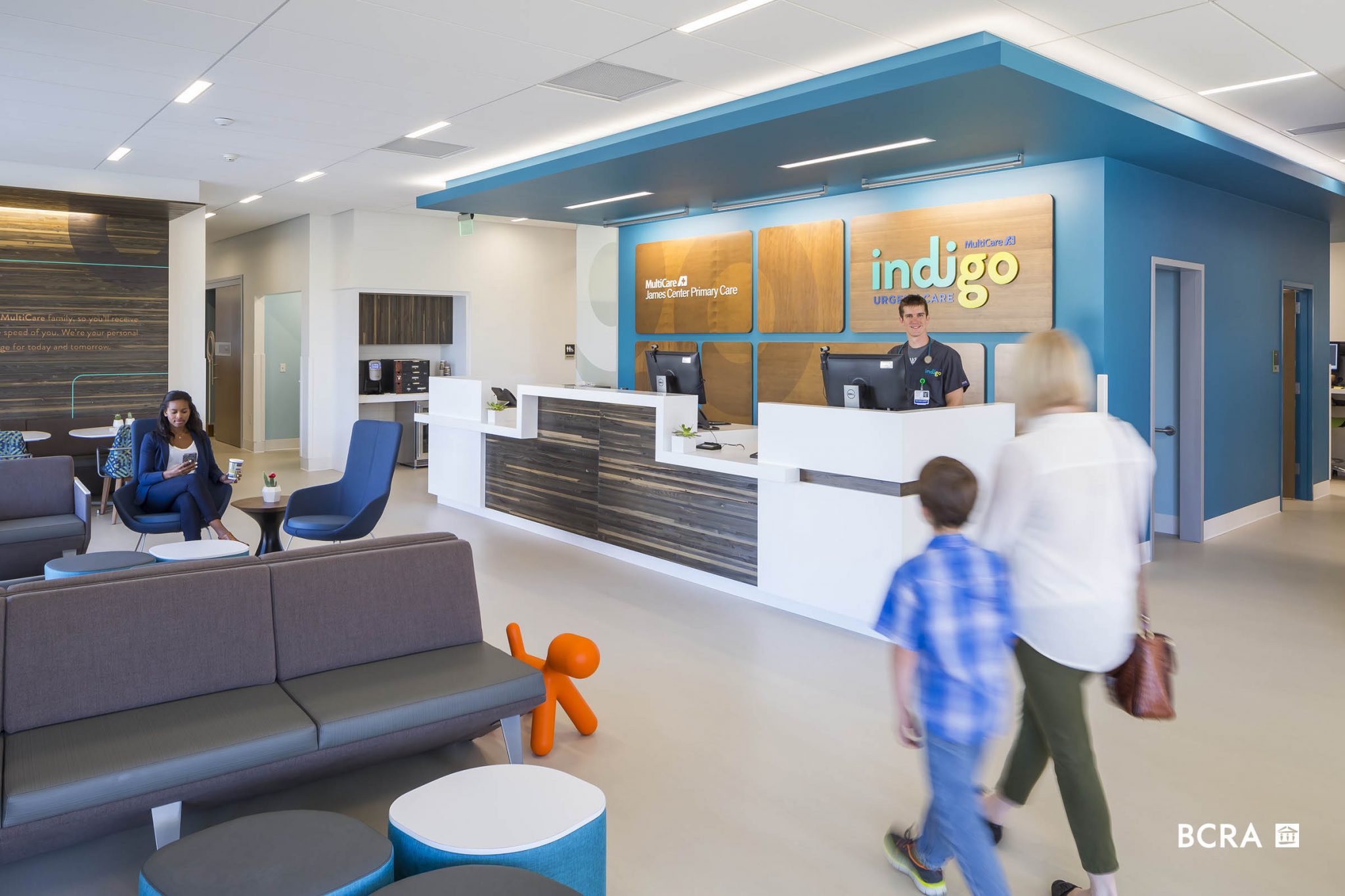
The lobby of INDIGO Urgent Care in Tacoma, WA. In 2017, the facility won an International Interior Design Association Award in the Ambulatory-Urgent Care category.
Looking at all the different projects that BCRA has completed, it seems like there are so many different directions you can take the theme of the design. Sometimes it’s inspired by the surrounding landscape, or maybe it’s inspired by the end users of the building. Since there are so many directions to go in, how do you narrow down on one?
It all starts by sitting down with clients [and learning] who their audience is, who they’re trying to communicate with, not just today but over a long period of time. Because a lot of what we do is not meant [to last] for a month or two. Much of what we do, because it’s with the built environment, has a significant price tag with it and [requires] a significant effort to make successful. My projects are often meant to last a minimum of five to ten years, if not longer.
With that commitment, there has to be serious research to figure out who the audience is, how we want the audience to react, what do we want them to gain from that experience at that point and what we want them to walk away with. Those [objectives] must be set up very clearly at the beginning.
Now, we have clients that aren’t quite sure what those are, so we make sure to take the time to help them parse the objectives out. If we don’t do that, our projects won’t be successful.
What are your methods for determining that messaging if it’s not as clear when you start working with a client?
There’s a number of ways. One of the businesses we work a lot with, are K-12 schools, and often you’ll find they do have kind of a messy understanding of how they communicate who they are to audiences. So as a brand, they’re not used to using that kind of language, they’re not used to really saying who “we” are.
They’re used to saying, “We’re the Bobcats because we have always had a bobcat mascot. We’re part of the community, because we’ve always been part of the community.” They have yet to [think about questions like], “If you had a bunch of people in the community, how would they describe you as part of the larger community? What would they value in you? What do you value in them? What is your current public messaging and how have your messages changed over time?”
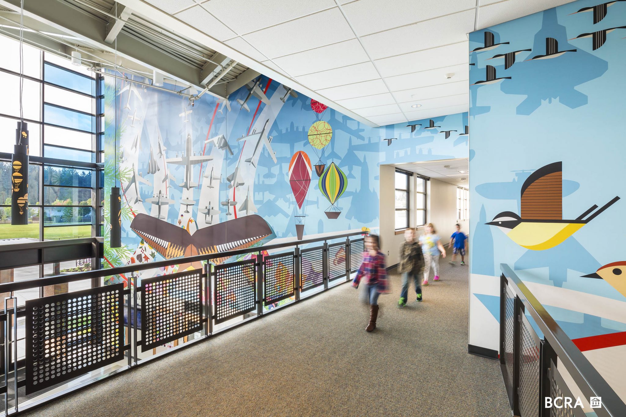
The flight-themed murals at Carter Lake Elementary in Joint Bases Lewis-McChord, WA., reflect the backgrounds of its young students, who largely come from military families .
What it breaks down to is we do a lot of interviews and questionnaires. At times, we do public meetings or isolated group meetings. At times it’s just the students—asking a group of third graders, “What do you value about your school? What do you tell other people when they come visit you about your school?” It’s a lot of conversation.
Additionally we bring in other specialized professionals outside of our little group. [For a non-profit that wanted to create an exhibit teaching children about financial literacy], we brought psychologists in so that we could help explain the methodologies of how to teach about it, because they were struggling with [the educational approach].
We had to assist the client with understanding how the mind is processing this content differently than if they’re learning spelling, basic arithmetic and the arts. [We had to explain] that the process of understanding money has a lot more to do with [your] interaction outside in the real world, not in a confined space. It’s important to bring other professionals in when we really know the client is lacking specific knowledge or perspective.
What’s one project that you’ve been proud to be a part of since joining BCRA?
One was the beginning of a series of projects, for St. Michelle Wine Estates—the 14 Hands Winery. That was a great project because it was a brand that only existed on wine bottle labels and [online]. They didn’t have a physical environment. So the goal was really to help the client create a physical brand in an environment that allows for agri-tourism, where more and more people are wanting to visit working wineries.
It was a process of inclusion of architects, interior designers, landscape architects, structural engineers, civil engineers and experiential graphic designers. And one reason I’m proud of it is that we had to take a brand and physically give it real meat. We had to create an environment where it felt like it wasn’t an upshot company. There really had to be a sense of the place exuding history.
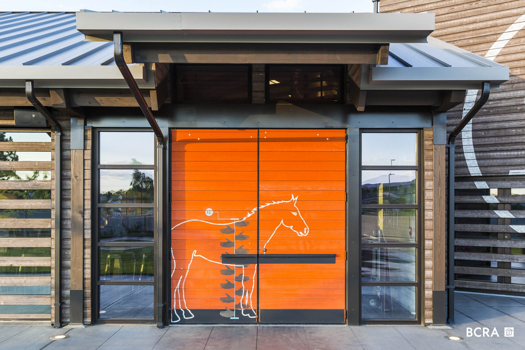
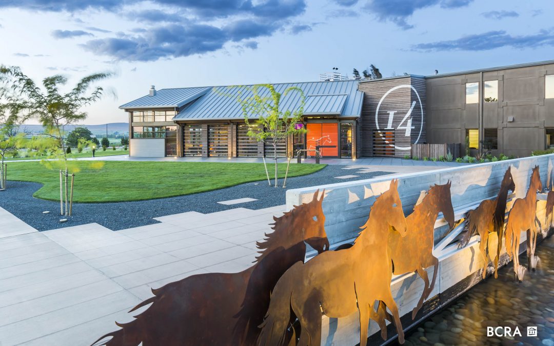
The branding for the 14 Hands Winery Tasting Facility in Prosser, WA. was inspired by the wild horses living in the surrounding Horse Heaven Hills area.
“Euro Cowboy” was the nature of the physical branding that we came up with. And, it all started with a reference to the history of the agrarian culture of the area. The whole user experience is meant to have this connection with the land, but also with a facility that’s high tech and [flexible for social occasions], whether it’s for events or for 20 people who come to taste the wine.
That’s part of the wonderful nature of agri-tourism, people go specifically just to visit, to have these experiences, to enjoy their surroundings, and to make memories. And it was a great opportunity for us to really engage in defining a brand [through tools like] wayfinding, which is a component of what we typically do, to more experiential graphics, which are interpretive in nature (we have a whole area where it explains how the different barn wood comes from different barns within the local region), to the broader branding of 14 Hands to make it a significant, signature location for the brand.
Angela Suico
Writer / Content Strategist
A storyteller by trade, Angela is passionate about storytelling and human-centered design. She recently received a Master's degree in Integrated Marketing Communications (IMC) at Northwestern University.
3 ways to improve and inspire Scientific Branding
How do you take a scientific organization focused on the infinitesimal and brand it in a big way?
Read More.

